For a movie about Adam Driver fighting dinosaurs, 65 sure came and went without much fanfare. The futuristic survival film — a collaboration between A Quiet Place writers Scott Beck and Bryan Woods — quietly slipped into theaters in March and was immediately overshadowed by Academy Awards coverage.
With the movie now streaming on Netflix, though, new audiences will rapidly find out what those few theatergoers already knew: 65 features a unique world that seamlessly blends analog and digital technology.
This is a film every franchise director should study: It’s a how-to guide with a clear vision about crafting a lived-in world straight out of classic science fiction, but with the full benefits of modern tech. Unlike so many of its peers, 65 draws inspiration equally from all periods of Hollywood science fiction, and its depiction of technology should become the gold standard for production designers from now on.
Over the last century, our vision of the future has been a moving target defined by advancements in practical and digital effects. Everything in Star Trek’s Kelvin universe films contradicts the retrofuturism of Star Trek and Star Trek: The Next Generation. Similarly, the production design of the Star Wars prequels takes full advantage of green screen technology to add new characters and locations into an existing, practically built galaxy, creating a visual disconnect that modern Star Wars shows like The Mandalorian and Andor are still working to merge.
Photo: Patti Perret/Sony Pictures Entertainment
Perhaps the most apparent dichotomy is between 1979’s Alien and 2012’s semi-prequel Prometheus, especially given Ridley Scott’s role as director of both. Although the latter is supposed to take place almost 30 years before Scott’s seminal sci-fi horror film, the anachronisms created by 40 years of VFX improvements are minorly amusing.
So in the era of IP, how do filmmakers revisit old franchises while still honoring the design breakthroughs of films released decades ago? For many creators, the answer is retrofuturism — a design framework that expands the scope of futurism on screen by reclaiming design principles from failed visions of tomorrow.
Unlike conventional futurism, which guesses at future technology based on current trends, retrofuturism draws inspiration from historical projections of the future, particularly from the American Atomic Age. If you made a modern movie in the style of Atomic-era cinema — reclaiming 1950s science fiction like Forbidden Planet or This Island Earth — the resulting analog technologies would be retrofuturistic design principles at work.
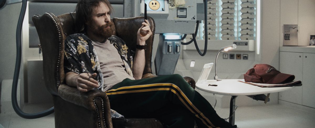
In the hands of a talented production team, retrofuturism can be used to give films a lived-in feel, showing that the future is, for better or worse, a reflection of modern societal challenges, rather than an evolution. The internet’s outpouring of love for Pedro Pascal brought new audiences to Prospect, Zeek Earl and Chris Caldwell’s film set in a workman portrayal of humanity’s future. Duncan Jones’ Moon blends the best of 1970s science fiction set design with 21st-century special effects.

And while modern retrofuturism is often used to comment on the failed promise of post-war optimism in America — there are no flying cars in retrofuturist societies, and no robot butlers — there are still films that tap into the boundless potential of the space race. Arati Kadav’s Cargo and Jack Plotnick’s Space Station 76 remind us to put our hope in people instead of technology, and they find warmth where other science fiction stories don’t.
But in embracing our past, these films also reinforce the inherent split in Hollywood futurism. Filmmakers can look to our past or imagine a more advanced tomorrow, but movies that attempt to do both — with production aesthetics that look for the best in both analog and digital visions of the future — are few and far between. That’s what makes 65 such a fascinating example of on-screen world-building.
Set 65 million years in Earth’s past, 65 carves out a space that’s unique among its peers. 65 protagonist Mills (Adam Driver), the interstellar equivalent of a long-haul trucker, lives in a society not unlike our own. In the film’s opening minutes, he admits that he’s only taking this particular delivery job for some much-needed help with his daughter’s medical bills.
But in a script with so little dialogue and backstory, the way technology is presented is more important than it would be otherwise. The design of Mills’ ship and its equipment needs to feel advanced enough to represent an interstellar civilization, but retrograde enough for an economy where affordable health care is still the stuff of, well, science fiction.

Image: Universal Pictures Home Entertainment
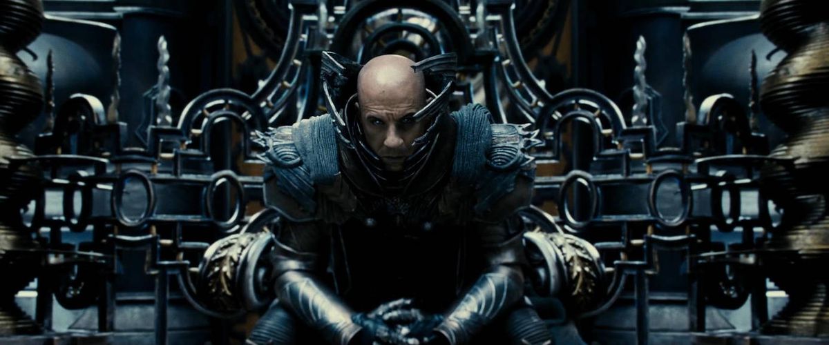
That means there are genuine narrative reasons for 65’s technology to blend futurism and retrofuturism in equal measure. It should come as no surprise to learn that production designer Kevin Ishioka has a strong background in science fiction. As the art director for films like Oblivion, James Cameron’s Avatar, and The Chronicles of Riddick, Ishioka has helped imagine on-screen futures that run the gamut from sleek to scruffy. In 65, his team designs tools and equipment that blend the familiar and the unknown.
These little touches can be found everywhere. When Mills records an emergency message, the film combines a digital touchscreen with boxy buttons and a phone-sized mouthpiece. The resulting dashboard feels both futuristic and incredibly tactile. Driver’s performance incorporates the analog motion we might expect from a ’70s or ’80s film — an actor manipulating a physical prop — and combines it with a digital touchscreen and voice-over from the ship’s artificial intelligence. This blend of yesterday and tomorrow gives 65 a surprisingly timeless quality.
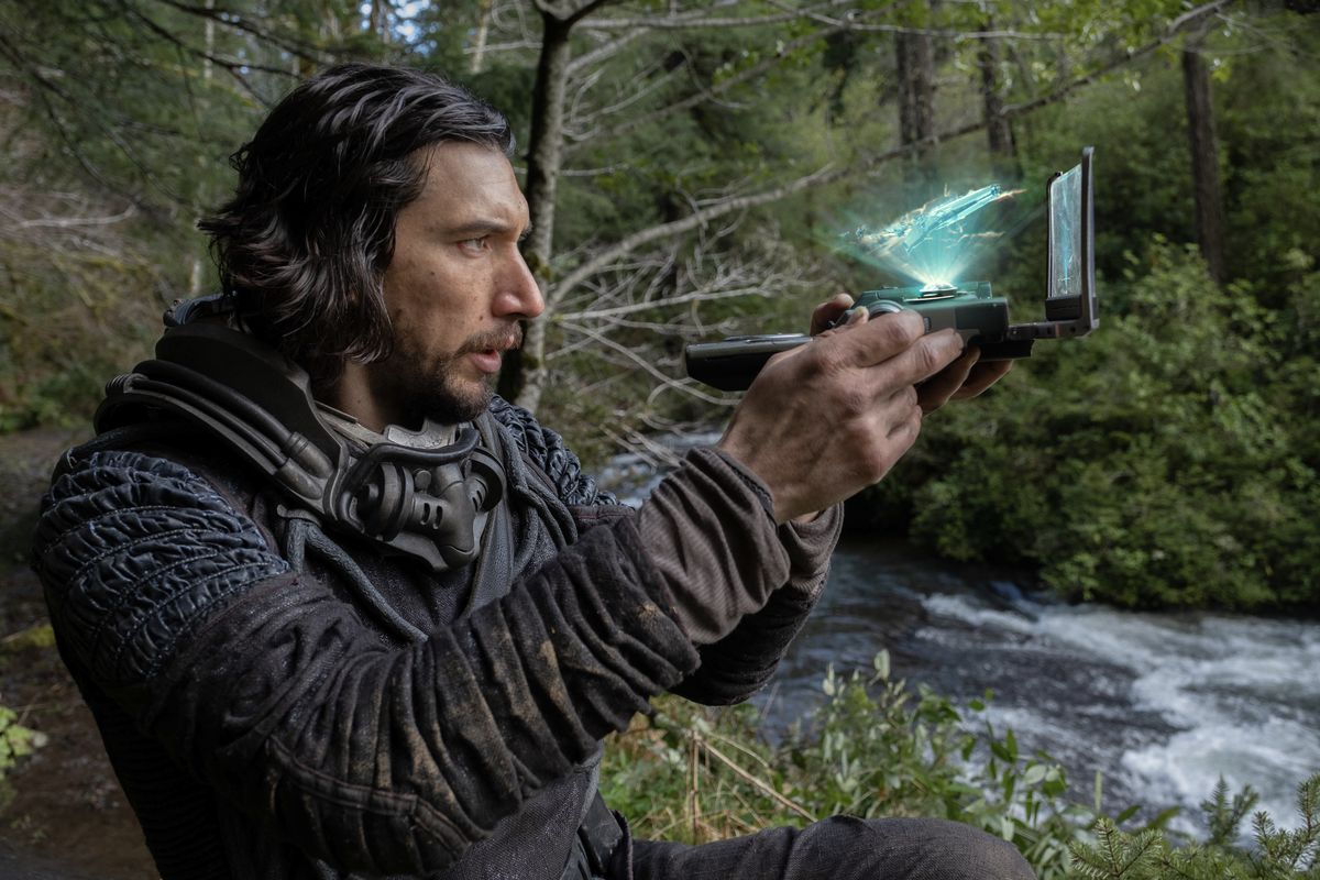
The best example is the portable scanner Mills uses to map his path across the valley. In shape and size, the scanner feels like a refugee from an early episode of Star Trek. In one sequence, Mills has to choose between holding his weapon and the scanner; he’s unable to juggle both. But once the device is turned on, the equipment becomes its own thing entirely. It has a physical screen — it’s visibly streaked with dirt the first time Mills turns it on — but it also has a holographic display and complex 3D environmental rendering. The latter is particularly imaginative. One of the movie’s best battles between humans and dinosaurs occurs almost entirely as a digital projection when Mills’ device clatters across a cave floor.

Image: Patti Perret/Sony Pictures Entertainment
Finally, there are production elements that belong to no period of science fiction whatsoever. While the screen of Mills’ slide projector sparks memories of low-budget ’80s hacker movies with its pixelated visual interface, the device itself mirrors the model of carousel slide projectors once found in every classroom in the country. The tiered glass cases in the dining hall — home to the scribbled communications between Mills and his accidental ward Koa (Ariana Greenblatt) about their journey to the mountains — evoke the automats once synonymous with 1900s New York City. These design choices project a vague sense of anachronism that only reinforces the uniqueness of the film.
Whether 65 is remembered as a quiet classic or just another streaming programmer, what it does with technology is remarkable. The movie effectively bridges the divide between past and present, ensuring that future audiences will recognize a version of their world in the movie. Since it isn’t currently lined up for a sequel or prequel anytime soon, I hope Hollywood looks beyond the box office and learns the right lessons from the production team. 65 is the blueprint for how to keep science fiction alive and vibrant, even in the rapidly changing world of special effects.
65 is streaming on Netflix now, and is also available for rental or purchase on Amazon, Vudu, and other digital platforms.

