What would Christmas be without the humble Christmas card? It’s hard to think of a more quintessentially British seasonal tradition than propping up colourful bits of stiff paper on your mantelpiece, but in fact we wouldn’t be sending each other bits of stiff paper were it not for a feat of pan-European collaboration – and competition – cooked up in the mid-19th century. Many of our most familiar traditions percolated down from Britain’s royal and aristocratic families, who themselves had imported many of them from their German forebears. But it wasn’t until the widespread adoption of colour printing in the 1860s that Christmas cards, first commissioned as high-status, handcrafted items in the 1840s, became cheap enough for the middle and lower classes to get their hands on them.
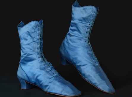
Some of these early mass-produced cards are on show at the Ashmolean in Oxford, as part of their Colour Revolution exhibition. To the modern eye they are pretty elaborate affairs, dating from the 1880s, with beautifully coloured floral images, silk tassels and fringes, dyed vibrant shades of purple and orange. The cards may be small but they are part of an important story, one that the exhibition aims to tell in a detailed way. It concerns the almost incalculably formative influence of the mid-19th century “chromatic turn”, in which the Victorians’ obsession with admiring, analysing and then manufacturing colour in all sorts of areas – fashion, art, design, advertising – made itself felt across Britain, France and Germany, and indeed the rest of the world.
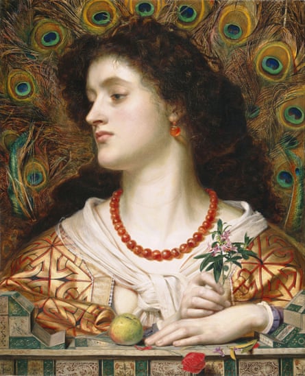
The Ashmolean exhibition is a brilliant and fascinating show, re-creating elements of the 1862 International Exhibition in London’s South Kensington, which showcased 19th-century attempts to reconstruct the original colours of ancient Greek sculpture (including Alma-Tadema’s fabulous painting Phidias Showing the Frieze of the Parthenon to his Friends), and some elaborate late-Victorian fashions, including a gruesome necklace made from dead hummingbirds.
The show’s key element may appear slightly dusty by comparison: a section outlining the development of synthetic aniline dyes, starting in 1856 with the invention of the strident purple known as “mauveine” by young British chemist William Henry Perkin, while studying under German professor August Wilhelm von Hofmann. Discovered accidentally as Perkin was trying to produce a malaria treatment from coal tar, mauveine – and its subsequent counterparts such as fuschine (reddish-purple), and induline (bluish red) – were cheap to produce and had enormous commercial success as, for the first time, brightly coloured fabric became affordable for large swathes of the European lower and middle classes, allowing them to indulge in fancy dresses, hats, upholstery and, yes, Christmas card tassels.
In fact, the Ashmolean show is something of an iceberg: it’s the visible tip of a much larger project, called Chromotope, that illustrates the vast amount of assiduous research and conservation work that often goes on largely out of sight. Funded by the European Research Council, Chromotope is an excellent example of a multi-disciplinary, multi-institution and trans-national initiative that is grappling with both leading-edge academic research and offering easily digestible insights to a public audience.
Charlotte Ribeyrol, professor of 19th-century British Literature at the Sorbonne in Paris, is head of the project, Chromotope’s “principal investigator”. She says that the aim is to “discover what happened to colour in the 19th century, particularly after the invention of aniline dyes”. “Colour is so appealing to so many people,” she says. “There are whole layers of meaning: artistic, literary, anthropological, religious.” To that end, Chromotope has enlisted the Sorbonne, Ribeyrol’s home institution, along with Oxford university and the Conservatoire National des Arts et Métiers (Cnam) in Paris.
“My hypothesis,” Ribeyrol says, “is that it was a reaction against the grime and pollution of the industrial revolution.” The image of the period that still lingers, she says, is essentially monochrome; fed partly by writers like Dickens and Ruskin who bemoaned the despoiling of nature by the soot-covered urban sprawl, and partly by fashion and circumstance. “Queen Victoria, for example, wore black after Prince Albert died in 1861, for the rest of her life. Men largely wore black. Then the Victorians became nostalgic for cultures other than their own – medieval England, ancient Greece and Rome, ancient Egypt – and their perception of colour was radically transformed.”
The synthetic dye industry that created this explosion of mass-produced colour rapidly evolved into the engine room of much of the late 19th and early 20th century economic expansion, via rapidly burgeoning chemical industries. Many of the most powerful companies in pre-war Germany – BASF, Bayer, Agfa, Hoechst – started as dye manufacturers, eventually mutating into the giant conglomerate IG Farben. It remains a question why, given the British head-start in the chemical dye industry, the UK surrendered its prowess in the sector to Germany. Matthew Winterbottom, curator of Decorative Arts and Sculpture at the Ashmolean and an investigator for Chromotope, suggests that some things have not changed. “August Hofmann went back to Germany in 1864 complaining of lack of British investment and education and training. With all its coal tar, Britain was expected to lead the industry, but Germany takes over and dominates the synthetic and chemical world.” Winterbottom points out that all this was contemporaneous with Germany’s newfound establishment as a nation-state in 1870. “It’s a newer and more confident place, with a vested interest in finding new industries, which leads to increasing competition and ultimately militarisation. It’s an extraordinary story.”
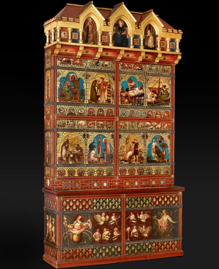
The Ashmolean exhibition is the most visible element of Chromotope’s activities – “when the ERC fund a project they always think about outreach,” says Ribeyrol, “that’s why the show was very exciting for them” – but backing it up is an open-access database called ChromoBase, which aims to collect mini essays and stories about the whole period, scientific analysis of early synthetic dyes and pigments, and a significant amount of original publishing, including Ribeyrol’s book about the Ashmolean’s Great Bookcase, a sensational but long-forgotten artwork covered in paintings by major artists including Edward Burne-Jones and Simeon Solomon, paid for by prominent gothic-revival architect William Burges.
“There was so much to say,” says Ribeyrol. “It was difficult to find a way through. But when I saw Burges’ bookcase, it was a revelation. I thought: ‘Wow, this brings together all the stories I have been trying to tell.’” Having been bought for the Ashmolean in 1933 by Kenneth Clarke for £50, this amazing creation had spent most of the ensuing decades squirrelled away at a country house in Devon, before being restored to the museum in 2016. Chromotope has commissioned extensive, non-invasive pigment analysis, which has suggested that not only did Burges – a noted and committed antiquarian – grapple with more modern, synthetic paints, but was possibly also diddled by crafty manufacturers when he did attempt to obtain old-style, expensive ultramarine blue pigments for his artists.
The question of synthetic and pre-mixed paints is also a key area: the manufacturing of non-natural paints predated the invention of aniline dyes with, for example, an early form of cobalt blue created by French chemist Louis Jacques Thénard in 1804, but the new science of colour meant, as elsewhere, their availability exploded. The portability, cheapness and ease of use had a direct effect: the impressionists were quick adopters, enabling them to paint out of doors in all kinds of weather. Claude Monet even worked for a while as an assistant to his older brother Léon, a successful industrial chemist who worked with synthetic pigments.
“This is the super interesting thing,” says Ribeyrol. “Not just the symbolism or aesthetics, but the whole tactile dimension of colour, its material existence. Those who make colours and use them; that history is somewhat ignored. What we want to do is add to our understanding of colour as matter, a substance with a life of its own.”