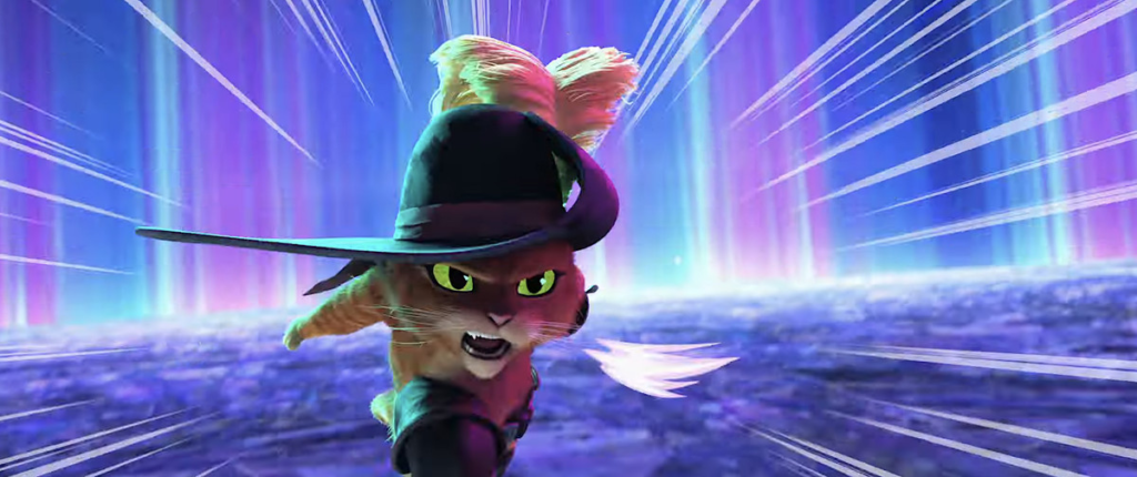
When Polygon asked Januel Mercado, co-director of Puss in Boots: The Last Wish, about animation that inspired the visual look of his DreamWorks movie, he had an easy answer: “Obviously Spider-Verse.” The movie’s evocative oil-painted style doesn’t look like the Shrek franchise that spawned it. But it doesn’t just give an existing series a makeover. Like so many American animated movies released in the last few years, The Last Wish veers away from the aesthetic that defined American animation for decades, working toward a more impressionistic and dynamic design.
And for that, we have Spider-Man: Into the Spider-Verse to thank.
In 2018, the first Spider-Verse movie redefined not just superhero blockbuster movies (and if you want to get specific, Spider-Man movies), but also American animation as a whole. Its stylized approach celebrates animation as an anything-goes medium. Not only did it show audiences what animated movies could look like, it also emboldened directors and animators to push the boundaries of accepted aesthetics and take a chance on more stylized and personal art.

For most of the history of American animation, studios have been copying past successes. The Disney house style defined cartoons for decades, and when Pixar started releasing movies, it set a series of CG standards that everyone else reached for. After one last wave of traditional cel animation, CG became the norm stateside. And while technology has radically changed animation from the days of Toy Story to 2022’s Lightyear, chasing realism became the stylistic norm. There’s nothing inherently wrong with that, but in the same way that it got tedious to see other studios copying Disney’s musical formula in the post-Renaissance era, it can be tiresome to see the same visual style over and over — not just for audiences, but for the animators creating these movies.
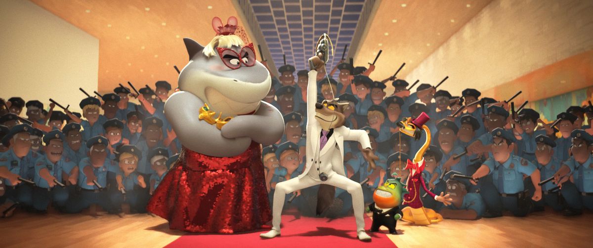
“I find [the long-standing style]… ‘boring’ is probably excessive, but I want to see something different,” says The Bad Guys director Pierre Perifel. “Frankly, I’m not the only one. […] You can see the trend is shifting a little bit.”
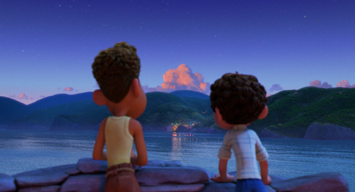
“We’re at this place where so much has been conquered [in terms of realism]. Now it’s more about, how do you use it? So it’s not like we have to make a completely new tool. It’s a little bit more: Oh, but can I actually not make it look realistic?” says Enrico Casarosa, director of Pixar’s Luca.


When it came to that 2020 sea monster movie, animating water offered an interesting scenario. For a long time, animators coveted the ability to animate photorealistic water — rendering convincing, believable textures was the ultimate goal. But Casarosa sought more warmth and expression for the water in his film: “The computer wants to do a beautiful splash of water that has every single droplet in it. And we’re like No, I would love it to be a beautiful line that is simple and poetic.”
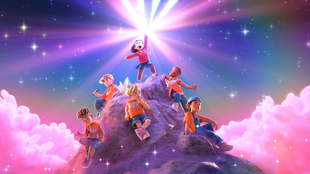
“There’s just something tactile that you kind of feel is missing from a lot of CG animation,” Turning Red director Domee Shi says. “When it came to shading clothing or skin textures [in Turning Red], there was just a little bit more of an artistic touch to it.”
Not every single animator out there is trying to break away from verisimilitude. Last summer’s The Sea Beast, for instance, definitely skews toward the side of realism, especially when it comes to the crashing ocean waves. But now, American directors have more of a choice — one they weren’t allowed to make before Into the Spider-Verse proved that audiences were hungry for stylistic experimentation.

Part of the long-standing limits they faced did come from the physical restrictions on what computers could render, but part of it was simply what studio executives deemed worth investing in. While American animation has stuck with one style for pretty much the last 20 years, international studios haven’t been bound by those expectations. Across the world, animators pushed the boundaries of what CG could be and fleshed out the hand-drawn animation that major American studios abandoned. Apart from the occasional Studio Ghibli movie, however, the majority of American audiences have been infamously indifferent to foreign animation.
Into the Spider-Verse wasn’t the first movie to reject the Pixar-influenced style of CG animation, but it was the first with such a distinct look to really reach American audiences, gain widespread critical success, and most importantly for studio heads, make a lot of money. The door opened for animators to take a chance on something new and different, and they were eager to experiment. Realism became an option, not the default.
Into the Spider-Verse’s sequel, Spider-Man: Across the Spider-Verse, pushes the first movie’s visual stylization even further, mishmashing dozens of different styles, from the drippy watercolor washes of Gwen Stacy’s word to the cut-out collages that make up Spider-Punk. Every moment of the movie is a visual feast, brimming with possibilities that will likely continue to inspire animators across studios.
“I think we may have fallen into a bit of a standardized version of CGI, which it doesn’t have to be,” Klaus director Sergio Pablos told Polygon back in 2019. “It’s good to see things like Spider-Verse, for example, pushing that medium. Because to me, every film should be an attempt at doing something different.”

