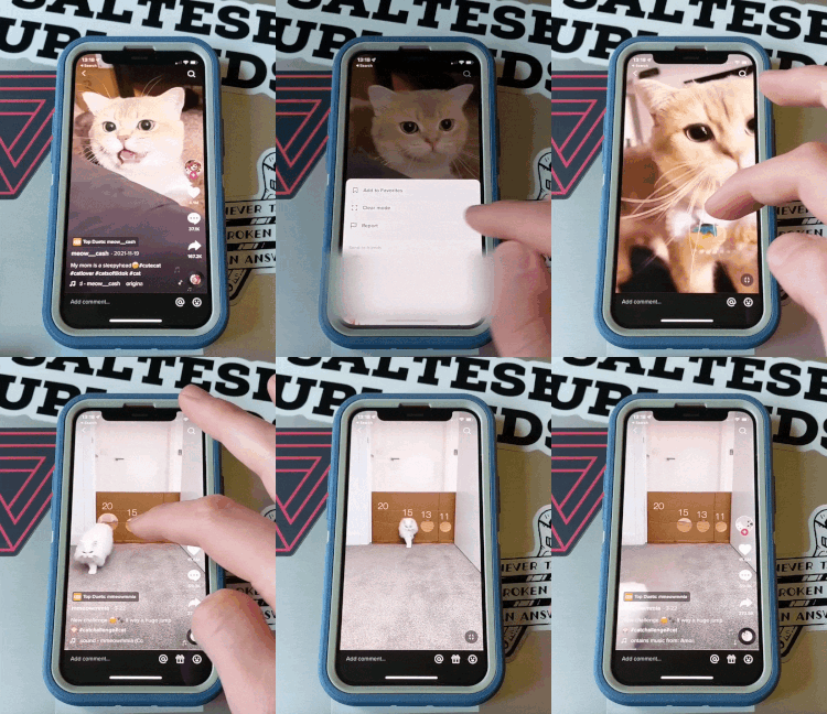
Some TikTok users have started noticing a “Clear Mode” option, which lets them watch a video without the UI overlay that usually shows things like the favorite and comment buttons and other info about the video. TikTok confirmed to TechCrunch that it’s currently testing the feature, but it’s unclear how many people have access to it.
Those that are in the test group (which includes at least two Verge staffers) can access clear mode by pressing and holding on a video, then tapping the Clear Mode button on the menu that pops up. The same method can be used to exit clear mode, and there’s also a button in the bottom right corner that will return you to the standard UI.
If you activate Clear Mode, you’ll be able to watch a TikTok without all the window chrome, but if you scroll to the next video, the UI comes back, and you’ll have to reenable clear mode if you want to get the true full-screen video experience. That’s not how I’d expect it to work, but it would make some sense for the company to build the feature this way; it makes sure that you’ll at least have the chance to see who made the video and what sound it’s using.
TikTok didn’t immediately respond to The Verge’s request for comment on whether that behavior is intentional.
I was able to use Clear Mode across TikTok — it was available when I was looking at the For You page, as well as on people’s profiles and even in videos that had been DM’d to me. It didn’t show up for ads, and interestingly enough, it wasn’t available when I was screen recording. In theory, that’ll help prevent people from using Clear Mode to steal content and pass it off as their own.
I don’t want to oversell this change, but to me, it makes the app feel useable. I’ve always hated how the UI, which mostly contains info I don’t care about, covers up a significant percentage of the video that I’m trying to watch. Clear Mode solves that issue. (Does the fact that I prefer it mean that Clear Mode is essentially old person mode? Perhaps.)
The fact that TikTok is adding this feels like stronger evidence that the company is focusing more on longer videos — within the past year, the maximum time limit for TikToks has expanded from one minute to 10 minutes. While the UI being in the way for a 30-second video might only be a bit bothersome, I don’t think many people want to watch something for 10 minutes while the main content is covered up by buttons and constantly moving text and icons.
Designing the mode to focus on longer-form content would also explain why you have to reenable it every time — if that’s an intentional choice. While it’s hard to justify activating the long-press menu and tapping the button to watch something that’s less than a minute long, it makes more sense for something that you’re settling down to watch.

