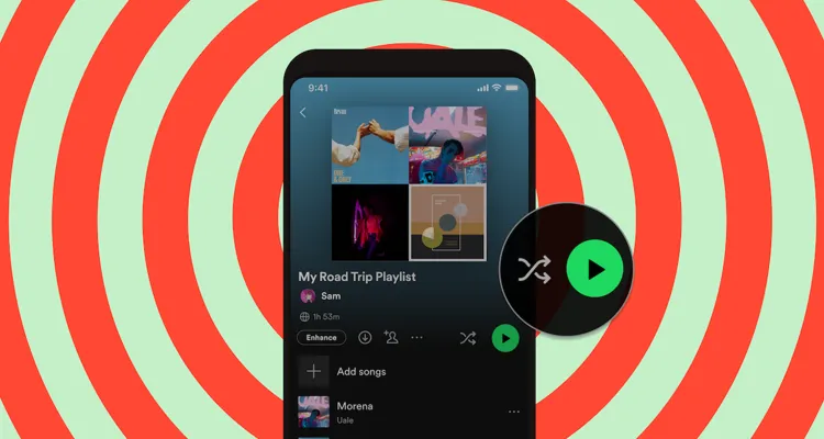
Photo Credit: Spotify
Spotify is launching individual shuffle and play buttons for its Premium users.
Spotify says the new separate buttons are intended to improve the listening experience. “This new change will allow you to choose the mode you prefer at the top of playlists and albums and listen the way you want to,” Spotify says in the announcement of the change.
The new feature is coming to iOS and Android mobile devices ‘in the coming weeks.’ It’s a server-side change, so expect the rollout to happen in batches. You may see friends and family with the new update before you and vice versa. The reality of the feature is that Spotify is asking users to pay for separate shuffle functions.
Spotify’s combined play/shuffle button has been a thorn in users’ sides for years now. Complaints pop up regularly on the Spotify Community forums about how the button looks and functions differently on mobile vs. desktop and even iOS vs. Android. Spotify users who switch between desktop and mobile found themselves having to re-learn an app they should have been familiar with.
Spotify has been tinkering with the feature for a few years now. It introduced the combined shuffle/play icon in 2020 to make it easier to stream music. But last year, it made the play button the default on albums at the request of Adele. Adele says artists release albums in a certain order, and they should be appreciated as such.
Spotify’s ‘upgrade’ gives Premium users a separate shuffle button next to the Play button default.
Spotify Premium is supposed to offer more features than its ad-supported tier. Spotify sees the shuffle feature as an extension of the ability to listen to whatever music you want on-demand. Shuffling through the music you’ve chosen is apparently a Premium feature worth paying for in Spotify’s mind.
Competing music streaming services like Amazon Music and Apple Music already have built-in separate shuffle buttons. The users of those apps also didn’t have to beg the company for going on three years for the separate option, either.

