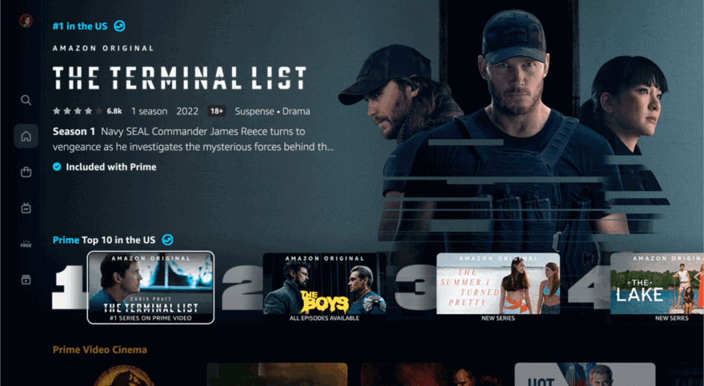
Compared to Netflix, Disney Plus, and other major streaming services, Prime Video has never been the most elegant or intuitive app. Its user experience lacks the polish of those competitors and feels more cobbled together. There are good aspects to what’s there — like the long-standing X-Ray feature that shows cast information and other trivia facts whenever content is paused. But Prime Video hasn’t received a significant overhaul or rethinking in many years.
At long last, that changes today. Starting now and continuing over the next couple weeks, Amazon will roll out a new Prime Video experience for Android and connected living room devices, including smart TVs, Fire TV streaming hardware, Roku, Apple TV, Android TV, and game consoles. Amazon says the experience has been designed to be “less busy and overwhelming for our customers.” The result, frankly, is something that looks a whole lot like Netflix. And maybe that’s for the best.
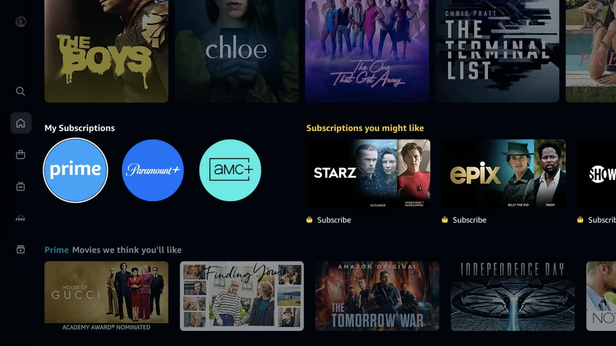
Prime Video’s main navigation has been shifted to the left side of the screen and is now a vertical column of icons. Those six main areas are Search, Home, Store, Live TV, Free, and My Stuff. The Home section has sub-sections for movies, TV shows, and sports. And the Store has similar sub-menus for Prime Channels (aka subscriptions), rentals / purchases, and deals.
There’s now a Top 10 list on the home screen so you can easily reference what’s popular, and the new Prime Video is much clearer about what entertainment is included with your Prime subscription. These shows and movies are designated with a blue checkmark in the description, whereas content that requires a rental or purchase will have a gold shopping bag icon. That’s cleaner than adding a badge onto every piece of TV show or movie artwork like Amazon was doing before, though it does mean you’ll have to dig into listings a bit to see what’s what.
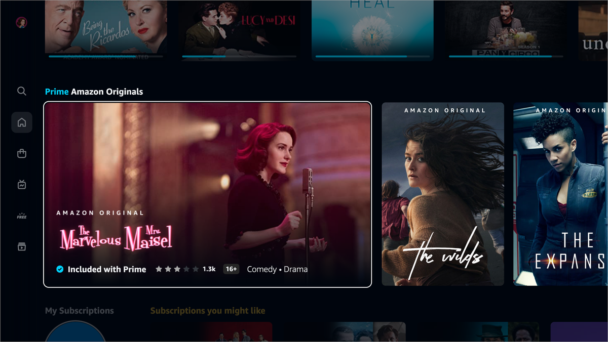
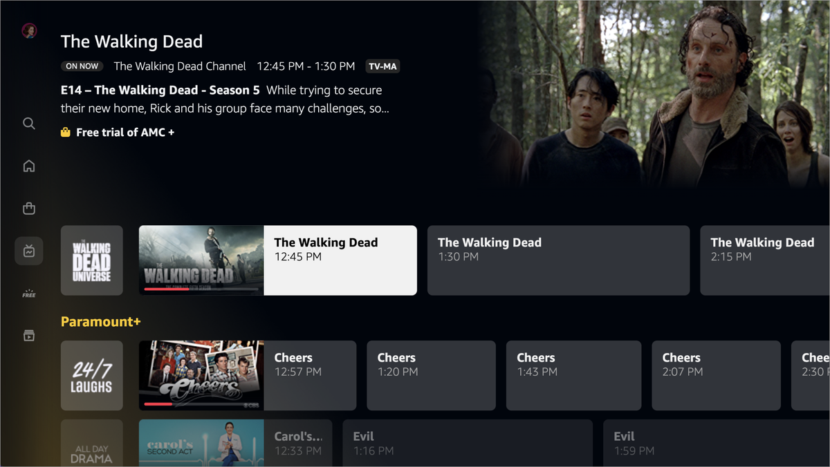
As you navigate around, you’ll find that many of the carousels retain the same landscape artwork as before. But Prime Video has also introduced what it calls “super carousels,” with portrait, poster-style art that expands into a video preview when you hover over a selection. Again, stop me if you’ve seen this concept elsewhere.
The redesign of Prime Video has been an 18-month project. As it’s gotten closer to the finish line, the new experience has been overseen by Ben Smith, who is now Amazon’s VP of product for Prime Video and Prime Studios. Smith is the same executive who led Hulu’s radical redesign in 2017. In hindsight, Hulu tried to reinvent the user interface and pushed too far in a new direction. Customers were quick to voice their grievances, and the company spent many months reining in some of the changes and returning to what was familiar.
By comparison, Prime Video’s redesign is deliberate, calculated, and — as the parallels with Netflix, HBO Max, and Disney Plus demonstrate — far less audacious. Amazon did extensive usability testing and user research, finding that people generally took to the changes very quickly. Considering the growing resemblance between all of these apps, that’s not very surprising.
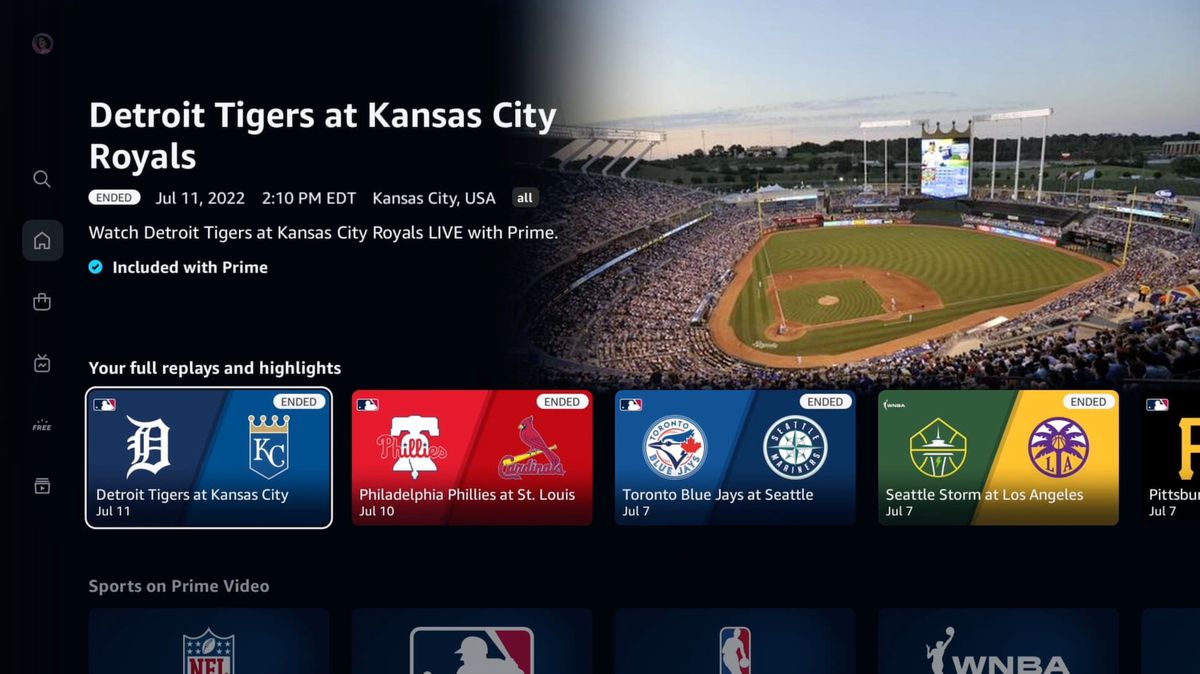

In some cases, the goal was to better highlight Prime Video’s underutilized perks. The new, dedicated Live TV hub provides a guide that aggregates linear programming from channel subscriptions like AMC Plus and Paramount Plus, plus Prime-exclusive live sporting events and ad-supported content that’s free for everyone. This interface is already available on the web but will likely be used much more widely now that it’s getting so much exposure in the Prime Video app. “In usability testing, we repeatedly heard the phrase, ‘wow, I didn’t even know Prime Video had live TV,’” said product director Helena Cerna during a recent press preview.
Prime Video has a new coat of paint and layout, but popular features like multi-user profiles, X-Ray, and Alexa integration are still present. Just as before, you’ll see quite a bit of promoted content, and Amazon is still trying to push subscriptions for third-party content onto customers — just as rumors swirl about HBO potentially returning to the fray.
Some annoyances have also stuck around: Prime Video still presents TV seasons in odd ways (episode 0: trailer, anyone?) and can sometimes separate 4K and HD versions of the same movie. Some of these head-scratching organization choices are due to the fact that Amazon still sells a lot of this content, whereas competitors only have to worry about letting you stream it.
After this initial phase of the rollout, the new Prime Video design will come to iOS and the web in the coming months. However, not all hardware will be able to run the redesigned experience. The PlayStation 3 and third-generation Apple TV from 2012, for example, won’t be updated. In cases where devices don’t get the new version, they’ll stick with what they’ve got currently and will continue to provide access to Prime Video into the future.

