Take a look at the map below. It probably seems to you like everything’s in order. That’s no fault of yours, given that the world maps you’ve looked at, whether in your high-school geography class or in the poster collection of someone who wants to appear worldly, are wildly inaccurate.
Don’t worry, the issue doesn’t lie in which countries connect and where. It’s not like Mexico’s been attached to New Zealand this whole time and nobody told you.
Don’t Miss
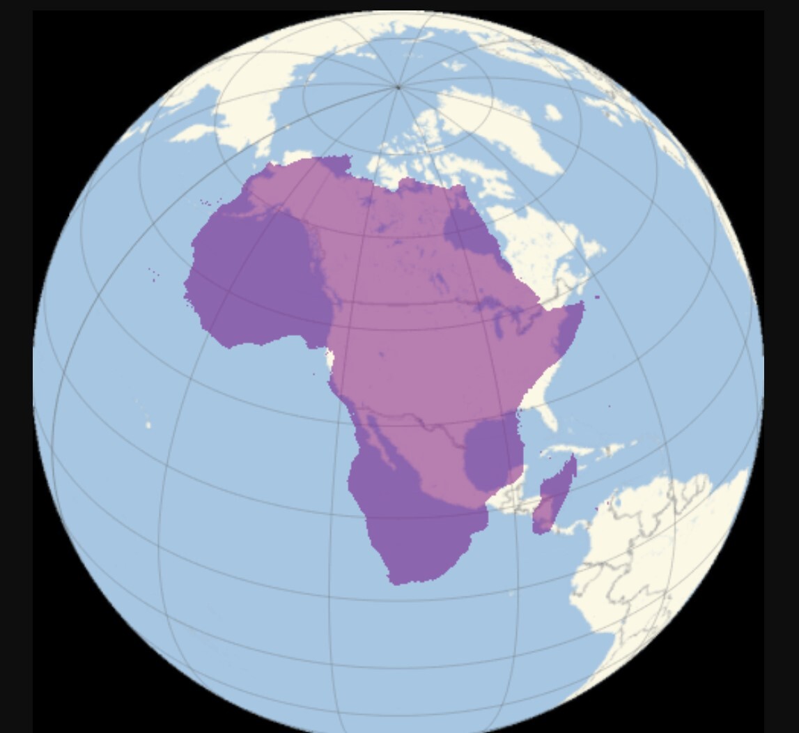
What is wrong — and significantly so — is the surface area and comparative size of the continents and countries you see. For example, looking at this, you might be able to tell that Africa’s obviously a bit bigger than the U.S. What it doesn’t clearly communicate is that the entire landmass of the U.S. doesn’t even cover a third of Africa. The U.S. measures in at a puny 3.8 million square miles, while Africa dwarfs it at 11.7 million square miles.
So why the hell have we been looking at places like the U.S. and Europe through a fish-eye lens, like they’re popping a sick kickflip, this whole time? Is it just because of good old Eurocentrism, white cartographers making the places they care about bigger because of a deep-seated insecurity?
Well, no, but there are some pretty good arguments that those preferences have both supported and benefited from the widespread adoption of this particular map. The problem here is obnoxiously simple: trying to show the surface of a sphere using a rectangle, which is straight-up mathematically impossible. If you don’t believe me, go try to peel a clementine and end up with neatly squared off fruit-skin. So, things have to be massaged into place.
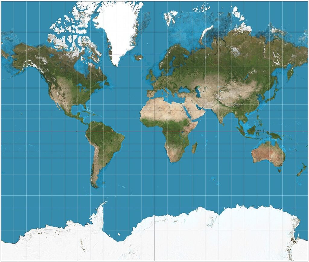
The process of representing the surface of our famously round earth as flat is called a “projection,” and the one you’re familiar with is known as the “Mercator projection.” It was drawn up by a Flemish man with sea travel at top of mind. After that end, he gridded out latitude and longitude, and then paint-by-numbersed his way to a world map.
You can start to see where that causes problems, since a latitudinal line a couple miles out from the north pole is a whole lot shorter end-to-end than, say, the equator. How this works out is that the further a country is from the equator, the more it balloons up, and eventually you have people thinking Africa and Greenland are the same size. When you actually stack one on the other, well, it’s not even something that could be reasonably called a “stack” as much as a “stain.”
As for what the world actually looks like, as mentioned before, that’s impossible to show perfectly in any two-dimensional media, the never-ending curse of the cartographer. That doesn’t mean that there aren’t a whole lot of projections that do a much better job than the Mercator. A popular alternative, one that’s been heavily pushed by cartographers for school adoption to mixed success, is the Gall-Peters projection, seen below.
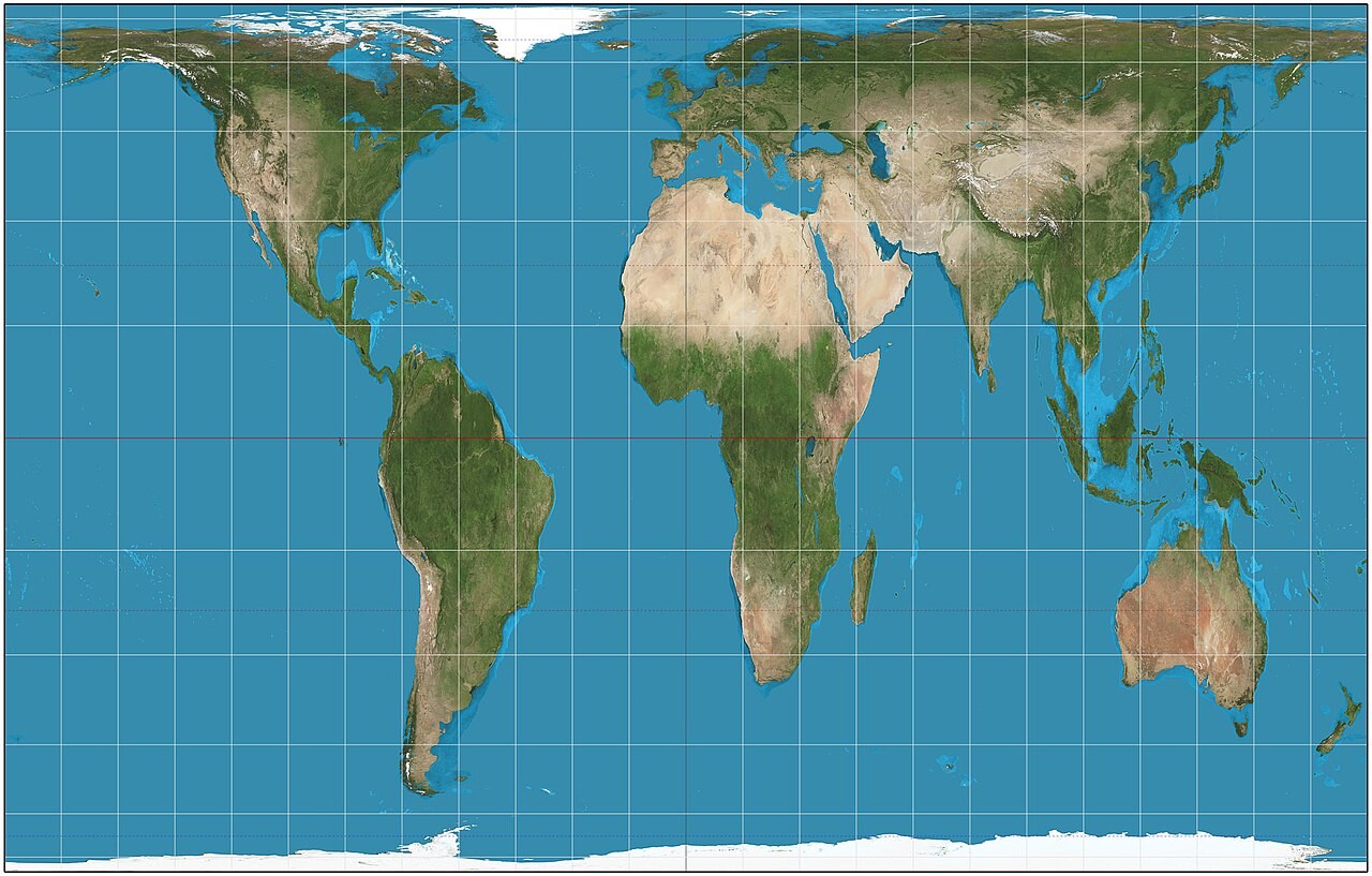
This map also has its inaccuracies, specifically the vertical stretching that might be giving you the most agita, so stay calm. What it does do much better is illustrate the relative areas and latitudinal distances between continents. Still, it’s different enough to be unsettling, especially when you know you’re sitting on that thing right now.
Part of the reason it’s suggested for school syllabi is because it’s more accurate, but not so accurate that everyone’s going to start breaking windows. You might be asking then, what’s the most accurate projection we have? To that, I have an answer, but probably not one you’re going to like. It’s surprisingly recent, showing just how tough this nut of ours is to crack. It’s known as the Authagraph projection, and it was produced in 2016 in Japan. Both the countries and the oceans are accurately represented.
So why aren’t we all using it? Well, if the Gall-Peters projection caused an existential crisis, I’d recommend not scrolling down.
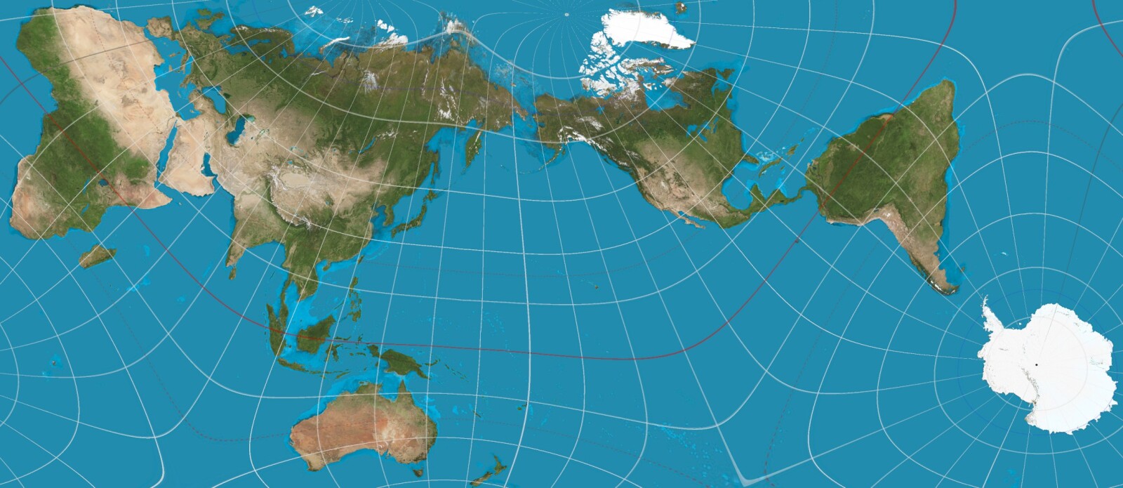
What looks like a child spectacularly failing a test in first grade is, in fact, the most accurate map of the Earth ever created. Put this up on a plane seat television and people are going to think they hit a wormhole.