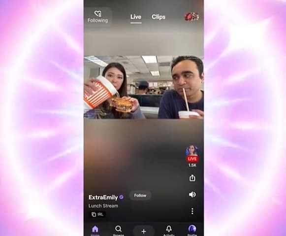
Twitch has launched its TikTok-esque mobile app redesign, and many users of the platform are calling for it to be reverted back to its original look.
After months of testing, Twitch revealed that, on July 29, 2024, its new mobile app would begin rolling out to users with its first complete redesign in years.
Instead of just a list of creators, the Twitch app now shows a TikTok-style feed of live streams tailored to your interest. Twitch curates the feed by using a list of the streamers you follow and sprinkles in a handful of similar recommendations.
In the days since the app was updated, however, many have taken to social media to share their distaste for the redesign. They’re calling for Twitch to change the app back to how it was before.
“Twitch needs to revert their mobile app. This sucks,” said Twitch streamer Gothalian.
“Why is twitch mobile app just tik tok now? App is garbage now,” a second user said.
Another chimed in: “What is the god awful layout on the twitch mobile app? Now we have this TikTok style scrolling to view your followed streams.”
Many are calling for Twitch to revert the app’s design entirely, including OTK member nmplol.
“For the love of god twitch please revert the changes you made to the mobile app,” he said in a tweet.
While many took to social media to share their thoughts on why they dislike the new app, others mentioned that they don’t think it’s all that bad.
Twitch streamer Fooya had some kind words about the update. She remarked: “I’m confused, the new Twitch Mobile is like the easiest thing to navigate? Why is everyone sh*tting on it as bad as they are?”
Another streamer said: “It’s honestly really nice outside of the following page.”
“I fail to see what’s so bad about it,” commented a third.
This comes just weeks after Twitch CEO Dan Clancy went viral after showing off the new features on stream with Rubius. During the broadcast, several hot tub streams showed up on his feed – prompting him to blame the algorithm.

