Yorgos Lanthimos had a deceptively simple directive for the production design team on “Poor Things”: to make the world look like nothing has ever looked before. It was a creative task that required the dual minds of Shona Heath and James Price, who set about to imagine an on-screen universe that evoked familiar inspirations while still appearing brand new.
“You would say, ‘It is like this’ or ‘Is it more this?’” Heath recalls of asking for guidance. “He would say, ‘No, it’s like nothing we’ve seen. It’s got to hit somewhere off the scale.’ And his ‘off the scale’ — we worked it out in the end, but it was very hard to pinpoint for ourselves. Sometimes the thing he wanted was really massive or really tiny or really complicated or really simple. There were extremes at either end of the scale. In the end, we used miniatures and huge LED screens. Old techniques and new, high-tech systems. We used everything.”
“What he was precise about was that he wanted it to feel like a 1930s studio film made with today’s technology,” Price adds. “He knew it needed to be built because of Bella being a made-up thing.”
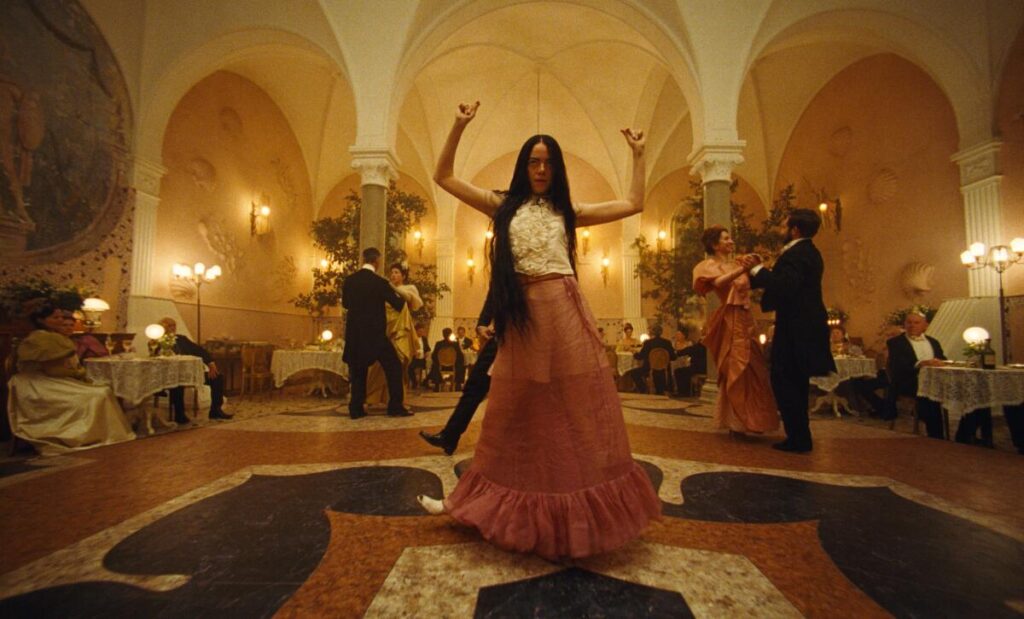
The scene where Bella (Emma Stone) memorably takes to the dance floor in Lisbon was an existing location, which the designers adapted by adding in a new floor, wall murals and different lighting.
(Searchlight Pictures)
“Poor Things” is a Frankenstein-like story about a young woman named Bella Baxter (Emma Stone) who begins life with an infant’s brain in an adult’s body. She begins discovering the world, going from London to Lisbon to a fancy ocean liner to Alexandria to Paris. Each location evokes the real-world place but puts a new spin on its geography and appearance, often drawing on historic paintings for design elements. The film is not set in a particular time period, allowing Heath and Price to look to both the future and the past when creating the sets. In London, Bella lives in the eclectic home of her creator, Dr. Godwin Baxter (Willem Dafoe).
“He is a surgeon and he is a maverick, and he’s confident,” Heath says. “So we had the confidence to take many architectural styles and splice them up and put them back together. We put in the obsession with the human body. The textures of the roof of the mouth was in the atrium. There were ears on the ceiling. We really started from the narrative.”
“We had a dogma of what the world could be,” Price adds. “We knew that we would have electricity, because we needed light for practical reasons. Once we agreed we could use anything, we used plastics, and then no material was off limits.”
The house, inspired by the architecture of Sir John Soane, was built on a soundstage in Budapest over 16 weeks and encompassed stairs, multiple rooms, a full garden with a willow tree and separate set for the rooftop. To create the vast London skyline seen from the roof, Heath and Price used a series of flat plane cutouts in front of a digitally produced backdrop. The smoke billowing from the chimneys was added with VFX.
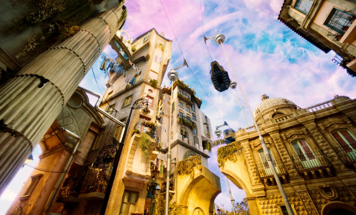
The scenes of Lisbon were built over 22 weeks on the largest soundstage in continental Europe.
(Searchlight Pictures)
“It looks otherworldly, but it still feels brilliant,” Price says. “There’s a romance there. We borrowed a lot of techniques that we’d learned about in film school but had never done.”
Not only did the designs look captivating on screen, they also helped the actors connect.
“So many of these rooms totally informed the way that we performed, because you walk into the set and go, ‘Oh, my God, this is breathtaking; this is unbelievable,’” says Ramy Youssef, who plays Dr. Baxter’s assistant. “I was looking at a lamp and going, ‘Man I’ve gotta act on the level of this lamp, because it’s so real and so 1800s, and it’s so — I cannot let the lamp down.’ When you have that level of detail surrounding you, you’ve got to be present.”
The padded white floor in one room was something akin to walking on beanbag chairs. It was, says Youssef, “a great place to rest between scenes and then get yelled at for putting an imprint in it.”
Lisbon was an even bigger endeavor. The city and its interiors were built over 22 weeks on the largest soundstage in continental Europe. Because the streets are undulating rather than flat, each section was constructed from steel frames and then cladded, finished and painted. The tiles were stamped with a custom design, and every detail was considered, including carved elements on the buildings. Heath and Price drew on Lisbon itself, as well as Ricardo Bofill’s Brutalist architecture and French illustrator Albert Robida, whose flying cars can be seen in the sky.
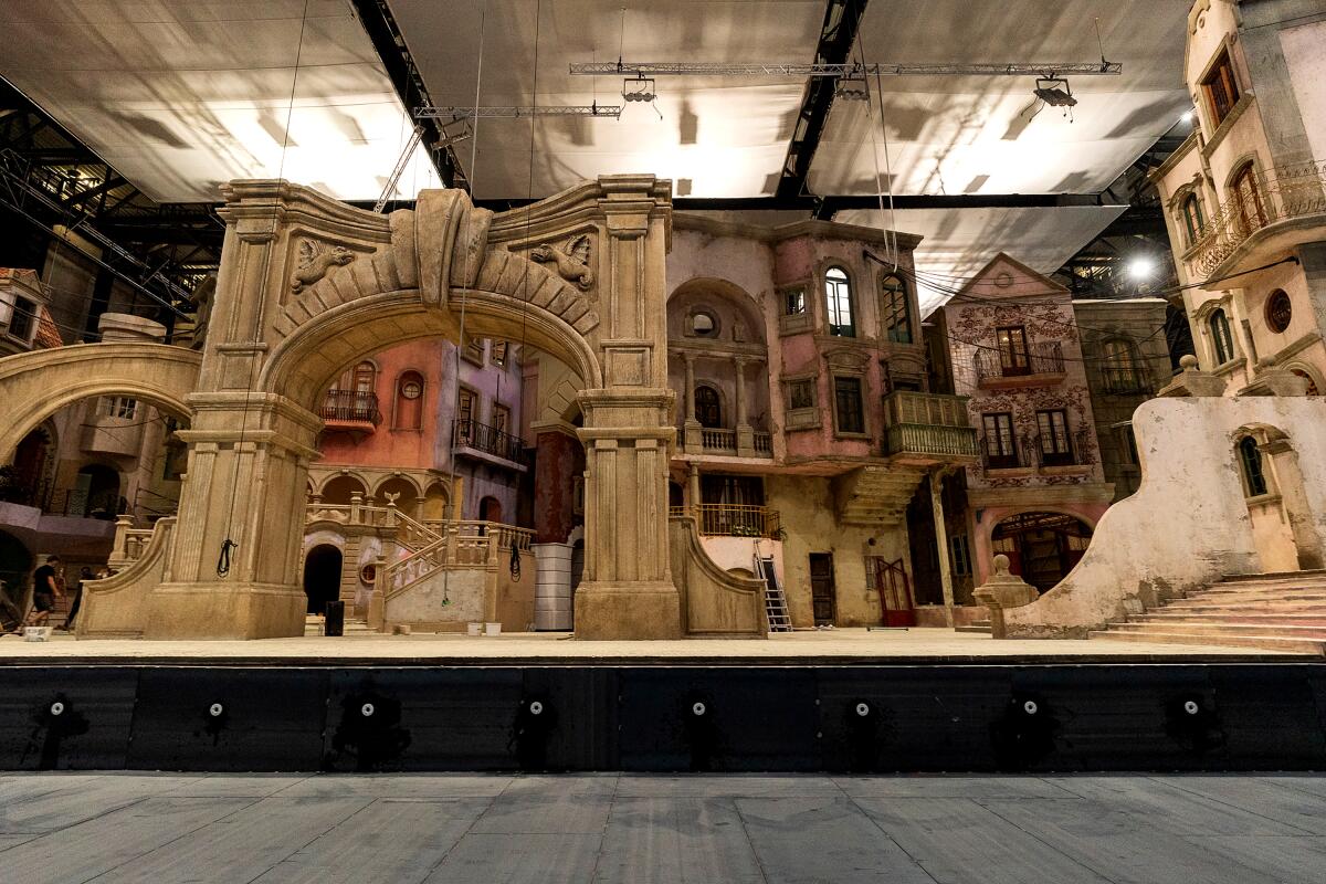
“For Lisbon, we ended up making a collage out of photocopies of all sorts of buildings we liked and we literally just cut it all up and shrank all the details we wanted,” says co-production designer Shona Heath.
(Searchlight Pictures)
To fully flesh out the landscape with the sea, there was a water tank and a backdrop that stood more than 170 feet long and more than 60 feet high. It took three scenic artists to paint.
“We wanted to distill the essence of the city and condense it and splice it up so we could get more of the feeling of a place in a smaller area,” Heath says. “For Lisbon, we ended up making a collage out of photocopies of all sorts of buildings we liked and we literally just cut it all up and shrank all the details we wanted. We put it together in a really happy-go-lucky way. In the end, I think we got a lot of energy into the cities because we pulled from everything.”
Their version of Paris is less colorful, with an emphasis on the monochromatic feel of the stone buildings. The team was inspired by Luigi Loir and Edgar Degas paintings of the city in the snow, and they built another expansive set where Bella could walk around the square and then go into the brothel, into her bedroom and look back down the square.
The cruise ship was equally big, with two floors and an exterior deck built in front of an LED screen. Alexandria, drawn from Massimo Listri’s book “Cabinet of Curiosities” and Hieronymus Bosch, was the only location not created as a life-sized set.
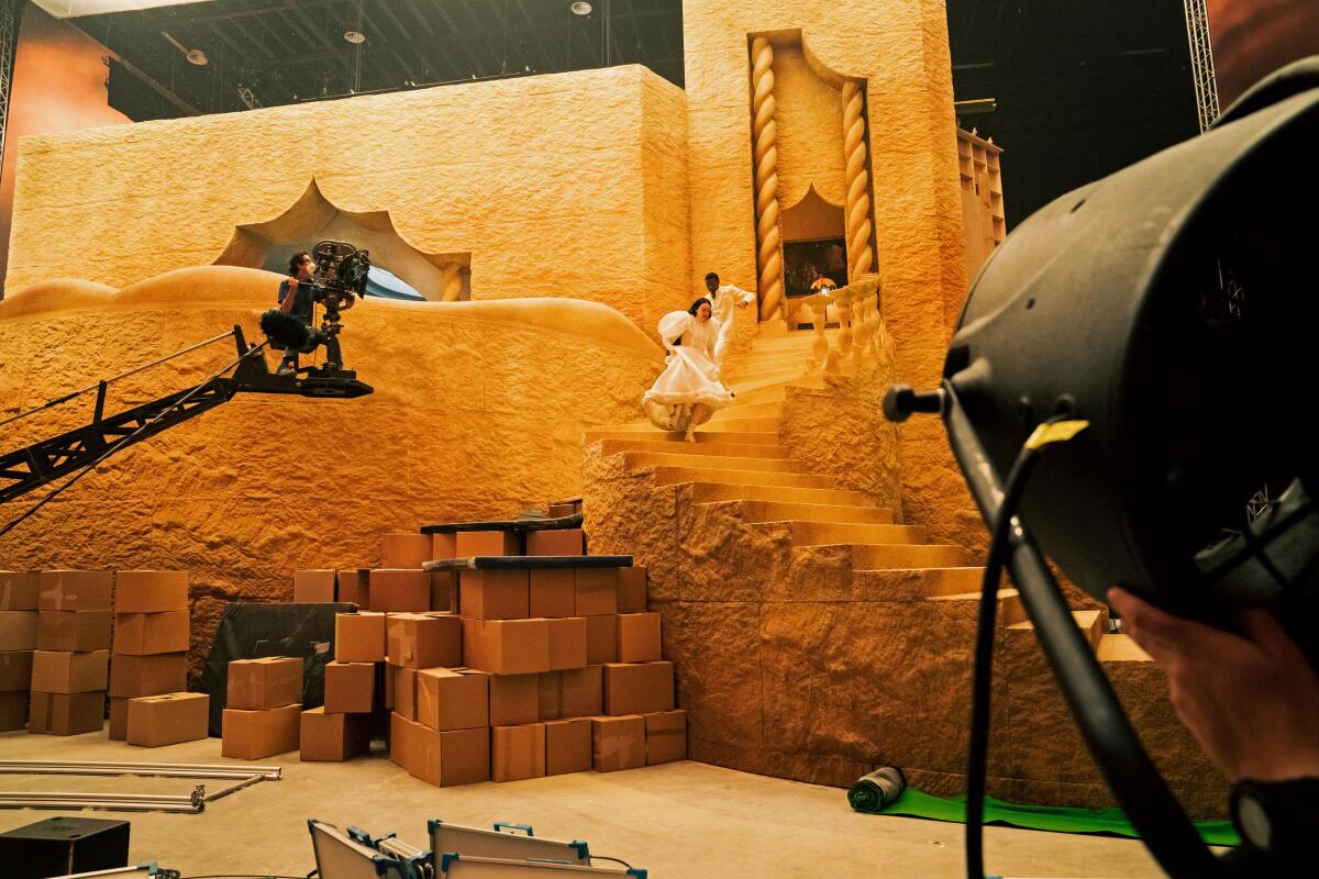
“It was an enormous miniature,” says co-production designer James Price of the Alexandria set. “It was 15 feet off the ground, because you had the steps coming down and had a wraparound LED screen as well.”
(Atsushi Nishijima / Searchlight Pictures)
“It was an enormous miniature,” Price says. “It was 15 feet off the ground, because you had the steps coming down and had a wraparound LED screen as well. We decided it was going to be an island, even though Alexandria is not an island. We were really unsure of how to do the moment where Bella sees the squalor. It’s a defining moment in her story, but you’re not there enough to warrant building that as a huge set.”
Only a few scenes in the film were shot on location. The scene where Bella memorably takes to the dance floor in Lisbon was an existing location, which the designers adapted by adding in a new floor, wall murals and different lighting. The medical schools and the church were also shot on location, as was the forest. But, of course, Price and Heath didn’t simply want to use the existing forest.
“All of the trees going across [the scene] we put in — they were suspended on wires,” Price says. “There are question mark trees you can spot if you look for them.”
In fact, there’s nothing in the world of “Poor Things” the viewer can take for granted, from the trees to the landscapes to the skies, which were visually enhanced. British artist Chris Parks, known for his fluid paintings, created textures for the skies that were filmed and then added digitally later.
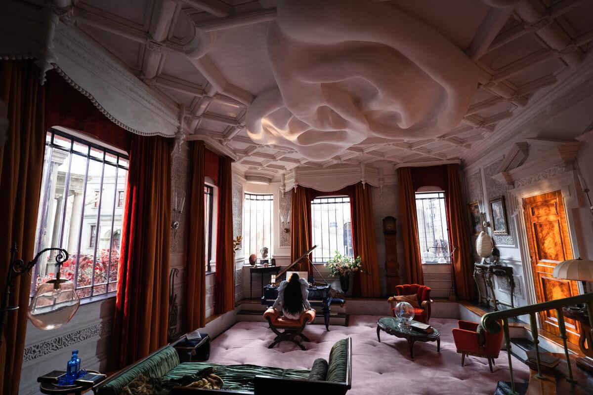
“There were ears on the ceiling,” says “Poor Things” co-production designer Shona Heath. “We put in the obsession with the human body,” she adds of the home of surgeon Godwin Baxter.
(Atsushi Nishijima/Searchlight Pictures)
“Even our skies have a physical value to them that didn’t start off as skies,” Heath says. “And everything that could be there [on set] was there. With the chapter headings, we made a real model fish for her to sit on. We built an eyeball bridge for her to walk across. The smoke was filmed in a tank, and the shot was put back together as a composite. Every single thing was broken down and shot and put back together. The detail and the craft just didn’t stop.”
“Poor Things” marks Heath’s first time as production designer on a feature film, and it’s Price’s biggest project to date. Although they were initially unsure of having two production designers on one movie, their collaboration proved fruitful. Getting the sets to look so unusual required a huge team of craftspeople to all be on the same page working against established norms.
“There had to be a sense of ‘It doesn’t have to be like that,’ ” Heath says. “And once people on our team, whether they were builders or other designers or painters, got it, they really ran with it and loved it. It was fun, and also very difficult, where we all served in an absurd and improbable approach to the design and build.”
“The way everyone’s responded to it and watching it with audiences, it’s becoming apparent that universally everyone is blown away by it,” Price adds. “It feels like we achieved what we wanted.”
Envelope writer Lisa Rosen contributed to this story.

