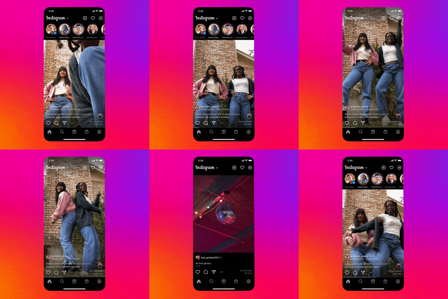
Instagram is testing out a new full-screen mode for its feed and an updated navigation bar in hopes of making content on the platform more discoverable and immersive. The test, which has been rolled out to “a limited number of people,” according to Meta spokesperson Seine Kim, is the latest effort from the company to compete with TikTok when it comes to social video.
If you’re a part of that group, you’ll be able to see videos almost entirely full screen as you scroll through your feed (the navigation bar will still appear underneath them). The description, as well as buttons that let you favorite or comment on the video, will appear along the bottom, and the Instagram logo and other top buttons will appear floating above the top.
The company has experimented with full screen on the feed before. Last month, it tested a design meant to highlight videos, though that still had white bars on the top and bottom of the screen. It also left the main navigation bar at the bottom mostly unchanged, whereas the company says it’s planning on also testing shortcuts for creating a post or message there.

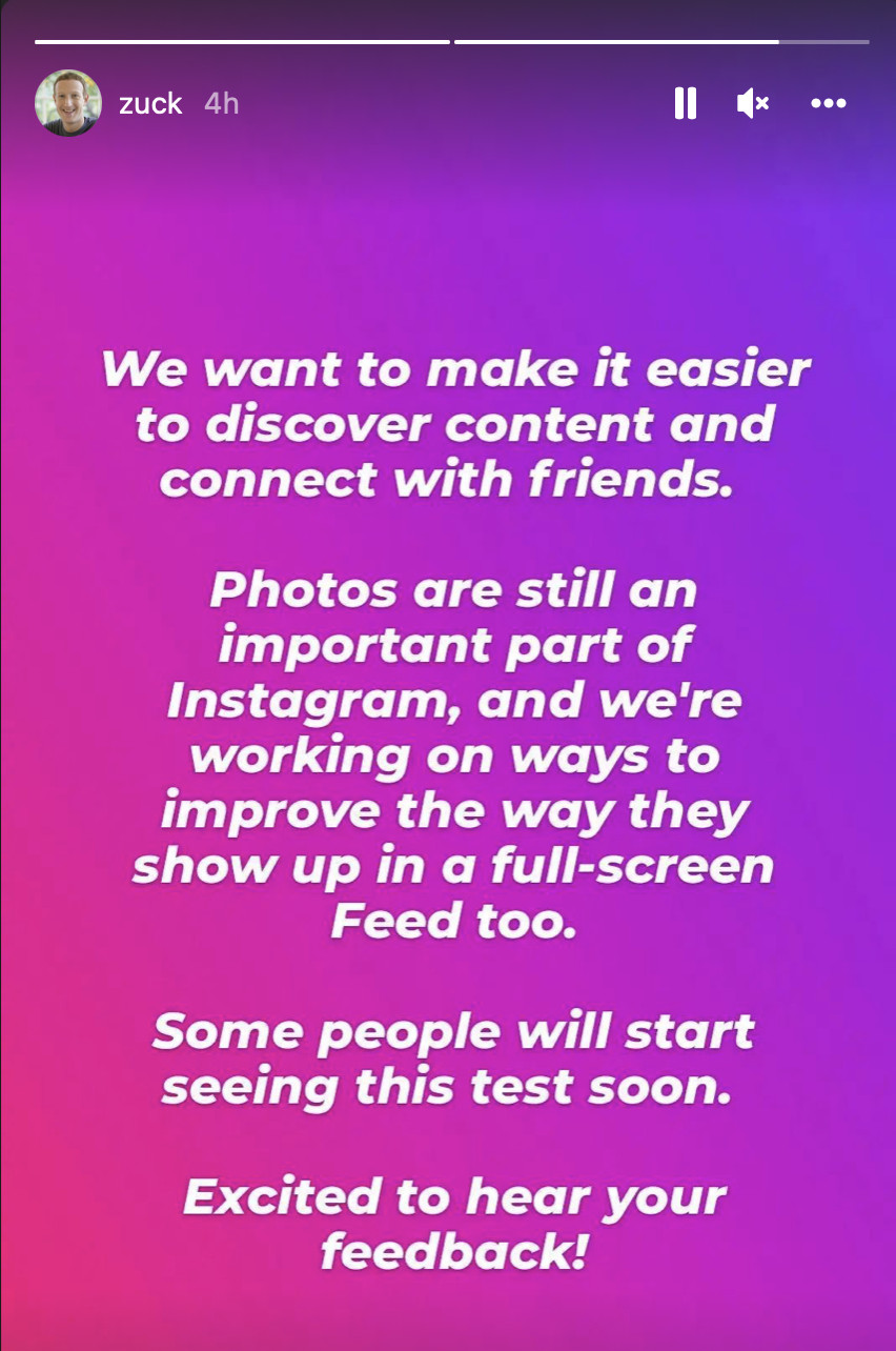
The experimental UI seems like yet another thing Instagram is doing to try and remain competitive with TikTok. While Meta CEO Mark Zuckerberg said in a story about the test that photos “are still an important part of Instagram” and that the company is working on making them more compatible with a full-screen feed, Instagram’s leadership has made it clear that still images aren’t the focus of the app anymore. The push to be more like TikTok isn’t just skin-deep either; my colleague Alex Heath recently reported that Meta is making changes to the algorithms underlying Facebook and Instagram’s feeds in an attempt to stay relevant to how younger people use social networks.
Correction June 16th, 3:10PM ET: The original version of this story incorrectly attributed the quote about photos remaining an important part of Instagram to a Meta spokesperson. The quote is actually from Mark Zuckerberg. We regret the error.

