At this year’s Comic-Con in San Diego, DC Studios had a minimal presence compared to Marvel. One big announcement was made by DC Studios co-head James Gunn, however. He revealed the new official DC Studios logo, debuting with Creature Commandos. However, this “new” logo is actually quite old. If you’re a DC Comics fan who grew up reading comics of a certain era, this new logo will bring all the feels. But why this one? The DC Studios logo is actually a take on the DC Comics logo used from 1976-2005, a nearly 30-year period that was an absolute highlight of the publisher’s creative efforts. Before we explain why, first a bit of history of the DC Comics logo.
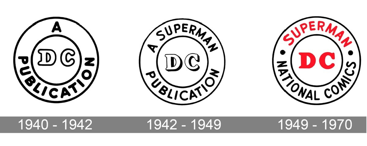
The publisher now known as DC Comics was founded in 1934 as National Publications. The company was actually made up of a pair of comic book labels, National and All-American Comics. National found great success early on with their series Detective Comics, the eventual home to Batman. Because of this, they called themselves “DC Comics,” although that would not be their official name for several decades. The DC logo only changed slightly from 1940 to 1970, and was very plain and nondescript. Once the Man of Steel became DC’s biggest character, the lettering on the logo changed to say “A Superman Publication,” with the letters DC in the middle. That stayed throughout the comic book Golden and Silver Ages.
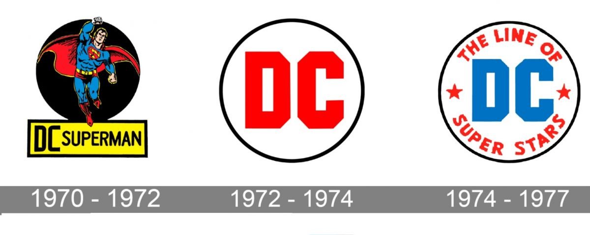
In the early ‘70s, DC Comics was having an identity crisis. Marvel Comics had come out of nowhere in the previous decade. By the end of the ’60s, Marvel began to dominate sales. DC seemed older and irrelevant, “your dad’s comic book company.” They hired Jack Kirby from Marvel, who launched his Fourth World line of comics, introducing Darkseid. They also leaned heavily into horror and war comics. During the period from 1970-1977, they had three different logos. It was clear they were a company struggling to find their branding. in 1976, a new young executive named Jennete Khan took over as publisher. She knew the company needed a big image change.
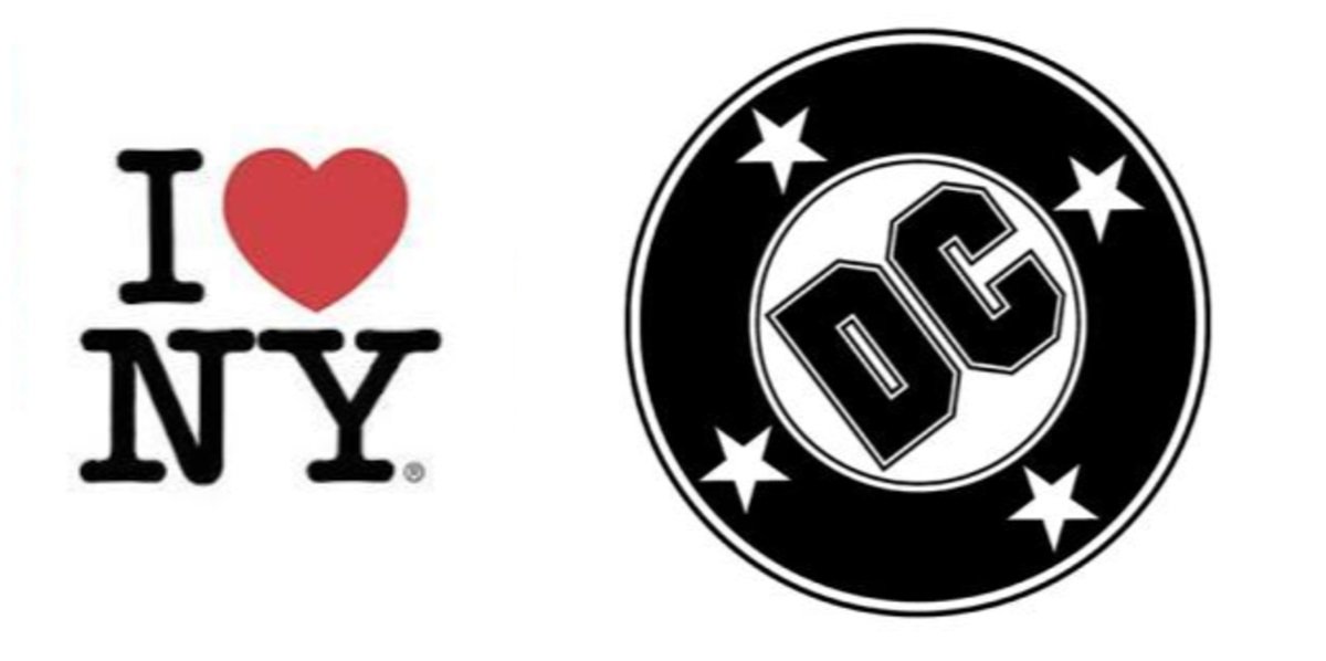
In 1977, DC found the logo that would be on the covers of their titles for the better part of the three decades. The new logo was designed by Milton Glaser, a legendary graphic designer who designed the “I Love NY” logo. The so-called “DC Bullet” was simple and effective. It also coincided with a creative growth period in the company that would change them forever. In the late ‘70s, this logo would adorn the cover of fan-favorite books like Legion of Super-Heroes and Black Lightning. But it was in the ‘80s when the true DC Renaissance would begin. This began with books like The New Teen Titans and Alan Moore’s Swamp Thing. DC followed these up with comics like Batman and the Outsiders and prestige series like Camelot 3000.
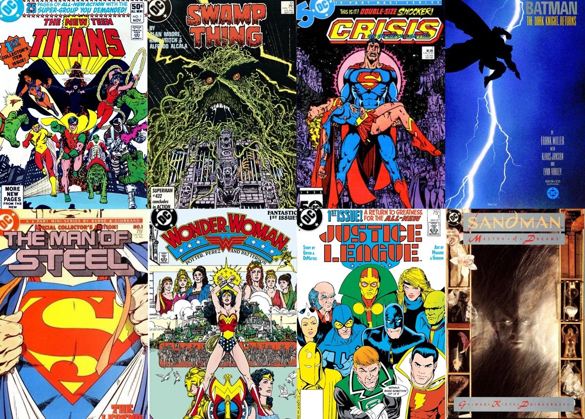
Then, in 1985, just in time for DC’s 50th anniversary, the company released Crisis on Infinite Earths. The series would reshape the DC Universe and sales would skyrocket. Among the iconic comics during this era were Frank Miller’s Batman: Year One and The Dark Knight Returns. Also John Byrne’s Man of Steel, George Perez’s Wonder Woman, and Justice League International, by Keith Giffen and J.M. De Matties. Alan Moore’s The Killing Joke, Grant Morrison’s Doom Patrol, and Sandman by Neil Gaiman all launched in this five-year window. And those titles just scratch the surface.
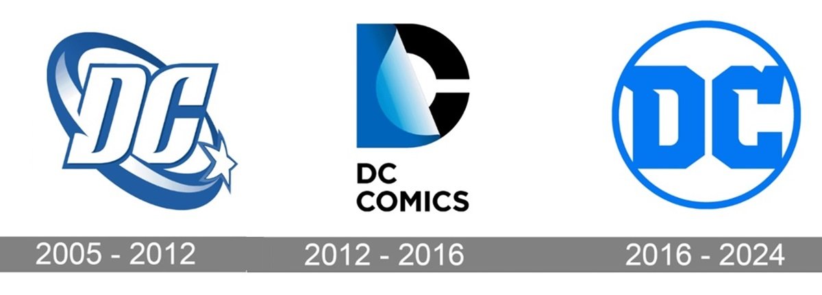
Throughout the ‘90s and early 2000s, the DC bullet was on the cover of every title, except for when DC’s adult titles switched to the Vertigo label. In 2005, DC created their first new logo in almost thirty years, which lasted seven years. During the New 52 reboot era, they launched yet another one, with the latest coming in the Rebirth era of 2016. But none had the iconic status of the DC bullet, which has come to symbolize an era of excellence at the publisher. This is why there’s no better logo for DC Studios, as that symbol instantly evokes memories of a time when DC Comics were at their creative peak. We think James Gunn made the exact right call.

