It may be the most famous album cover ever created.
The background – black. In the foreground, a shaft of white light pierces a triangular prism and exits separating into brilliant bands of red, orange, yellow, green, blue, and violet.
The artwork, as any true rock fan can instantly tell you, is for the 1973 Pink Floyd album Dark Side of the Moon. We know the band, we know the record, but who designed that album cover? It came out of the brilliant British design firm Hipgnosis, the subject of the new documentary Squaring the Circle (the story of hipgnosis). Anton Corbijn directed the film, which made its world premiere over the Labor Day Weekend at the Telluride Film Festival.
“The beauty of white on black [background], with colors, it’s just the simplicity,” Corbijn says of that prismatic design. “I think it’s a beautiful album sleeve, and I think it probably defines the album sleeve.”
Hipgnosis
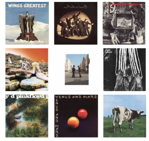
If Hipgnosis had created just that single unforgettable album cover it would be worth noting. But the outfit founded by Storm Thorgerson and Aubrey “Po” Powell designed a slew of iconic covers in the 1970s and ‘80s for some of the most significant artists in music history, including Led Zeppelin, Paul McCartney and Wings, T-Rex, 10cc, Peter Gabriel, Genesis, AC/DC, Black Sabbath, Yes, the aforementioned Pink Floyd and others.
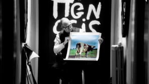
Unlike the stark graphic design for Dark Side of the Moon, many of Hipgnosis’s best known covers leveraged photographic images. Pink Floyd’s 1970 album Atom, Heart, Mother famously depicted a pastured cow looking over its shoulder toward the camera lens. Led Zeppelin’s 1973 album Houses of the Holy shows what has been described as “flaxen-haired nudist children” scattered across an eerily lunar-like landscape. As the documentary explores, the Houses of the Holy cover involved remote location photography, colorization in post and multiplying the two original child models into the nearly dozen seen on the cover (this was created decades before the digital era made such manipulation a snap).
Corbijn, a filmmaker, photographer, album art designer and music video director, says he grew up intrigued by the Hipgnosis oeuvre.

Hipgnosis
“For all the sleeves I was always wondering, how did they do that? Is it in-camera? How can you do that in-camera?” he recalls wondering. “Obviously, later I learned how good they were with cutting things up and making collages in a way that are invisible.”
Thorgerson and Powell chose the hybridized name Hipgnosis for their company as a play on hypnosis, but also “hip” in the sense of cool, combined with “gnosis,” a word from ancient Greek meaning knowledge or learning. Their work, too, reflected a hybrid of talents.
“Storm was definitely the artistic one, the big artistic one. And Po was a good photographer,” Corbijn notes. “And Po was a good salesman. He’s a great salesman. It helped in the film because he’s a great storyteller.”
Thorgerson died in 2013 at the age of 69. Powell, who turns 76 later this month, initiated the cinematic project.

Anton Corbijn
“Po came to Amsterdam to talk to me and to see if I was interested in making a documentary,” Corbijn explains. “Just listening to his stories, I realized there was a great story in there because it’s of course culturally important, but it’s also a human story between these two guys. So that was nice to have that interwoven.”
There was great affection between the Thorgerson and Powell, but no small measure of creative conflict. That was due in part to Thorgerson’s challenging personality – in the film, he is paradoxically described as rude but endearing. He could be exceedingly blunt, no matter how famous the client. McCartney once pitched Hipgnosis a cover concept — for the 1975 Wings album Venus and Mars — that Thorgerson rejected.
“To tell Paul McCartney, when he paid for you to go all the way to L.A. and say, ‘Well, Paul, I don’t like your idea. I’m going home,’ that’s quite something,” Corbijn muses. “I’m sorry I never met him. I would have loved to have met Storm.”
(An earlier McCartney idea for a Wings album cover, 1973’s Band on the Run, did fly with the Hipgnosis partners and they turned it into another of the most famous album covers in rock history).

Courtesy of Stephan Vanfleteren
Corbijn interviews McCartney in the film, along with many other rock luminaries with Hipgnosis memories to share, including Roger Waters, David Gilmour and Nick Mason of Pink Floyd, Jimmy Page and Robert Plant of Led Zeppelin, Peter Gabriel, and Graham Gouldman of 10cc. The stories are priceless, including the time Hipgnosis set fire to a guy for one album cover, and a photo shoot in London for a Pink Floyd record that went south, causing the Royal Air Force to dispatch fighter jets to track down an errant flying pig.
Corbijn was raised in Holland, cherishing many of those albums as a youngster, both for the music and the cover art.
“I had all the Peter Gabriel sleeves, for sure… I had a lot of Pink Floyd stuff,” the director tells Deadline. “When I grew up, music was my big love. I really connected to it… [collecting] record sleeves and music magazines. This was the ’70s, you didn’t have Google or anything, but all the information you needed was on a record sleeve.”
Vinyl has enjoyed something of a resurgence, but the era of iconic cover art has passed.
“There’s a lot of attention, again, for album sleeves,” Corbijn says, “but the importance of album sleeves will never be the same as in the ‘70s.”
Squaring the Circle (the title refers to the notion of putting a square album cover over a circular disc) is an acquisition title out of Telluride.
“We’re going to show it to buyers. So, hopefully in the next few weeks we’ll have more clarity about that,” Corbijn says, adding the Telluride premiere was a success. “It was very well received… an incredibly positive audience. It was really nice to sit in the middle of that.”
As a brand-new film without distribution, Squaring the Circle debuts without a movie poster. As he thinks about creating one, Corbijn faces a challenge similar to what Thorgerson, Powell and their associates encountered as they dreamed up album art decades ago.
Slapping the image from Dark Side of the Moon on the poster would feel too obvious, Corbijn says, so he’s thinking about combining elements of text with imagery yet to be determined.
He observes, “I have to see if the poster can attract people outside of the people who know the word Hipgnosis.”
