Virtual reality is for checking out. The wider the field of vision and the less light peeking in, the better. But as VR becomes more mainstream, there needs to be a way to quickly check back in with reality. A safe word, so to speak, to pull you out of VR, whether you’re feeling overwhelmed by a game or if you want to feel more present.
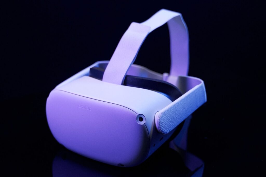
That’s exactly what the passthrough button offers on Meta’s Quest and Quest 2. It’s both a safety tool, as well as a practical one to let you see what’s going on outside of the headset without having to struggle to take it off. After firmly double-tapping either side of the headset where the straps attach to it, a view of your room — albeit a pixelated, monochromatic feed as seen through a handful of low-megapixel cameras — will show up on the display.
This button eliminates the need to take off the VR headset for minor interruptions. It’s there for those times when you need to gather yourself when someone’s calling for you across the room or if you want to grab a snack on your desk without making a mess. It gets bonus points for making you look futuristic while you tap your headset.
A safe word, so to speak, to pull you out of VR
But critically, this button is invisible — it’s not a physical button, just a specific spot on the headset waiting for a gesture. An invisible button risks being overlooked, and the opaqueness of activating passthrough mode could bury it out of sight for some users. That intention is important, though: being yanked out of an immersive VR session because of a misfired gesture or button press would not be ideal. Meta goes so far as to require you to manually enable the button. You have to flip a switch within the settings, where it’s positioned as a safety tool to make sure you aren’t about to endanger yourself (or others).
Even using the gesture to then turn it on requires deliberation. You’ve got to feel for the part of the head strap that connects to the headset, then make two quick and firm taps. Not the gentle “touching your smartphone” taps, but almost like you’re trying to awaken a creature in the headset to perform its job.
I would have enjoyed being a fly on the wall in the meeting at Meta, where someone won the argument that made it so the Quest 2 had this invisible button instead of a hardware button. Perhaps it was contentious. On one hand, if you’re selling something that dissolves the connection with reality (and can lead to injury or extensive property damage in inexperienced hands), a real, tactile button sounds like a good idea. But not everyone — especially early adopters of VR or experienced users — wants or needs that hand-holding. Having fewer buttons (just a power button and a volume rocker) makes the Quest 2 easier to learn how to use. What we got was a compromise, but importantly, it’s one that better lets the feature melt away when you don’t need it.
As cool as the passthrough button is for keeping you safe or letting you take a swig of a drink on your table, the feature itself could use some work. The piped-through reality isn’t easy on the eyes; it’s displayed in a single hue, overblows light sources, and often warps the view of reality in strange ways. I can forgive that since it’s not meant to be used for longer than quick bursts. For passthrough enthusiasts who obsess over quality (they exist!), Meta’s new $1,500 Quest Pro improves on that fidelity with a colorized feed, as well as a higher-quality picture. But while the Quest 2 allows no peripheral version — making a better case for passthrough mode —Meta took a different tact with the Quest Pro, keeping your peripheral vision so that passthrough mode isn’t necessary to see what’s on your desk or that someone’s coming your way.
Like 3D Touch or the programmable tap-on-back features in some newer phones, most people may not know that this secretive gesture-meets-button is just two taps away. But this quick shortcut that puts me in control of whether I’m seeing a virtual reality or my reality makes it one of my favorite things about the Quest 2.

