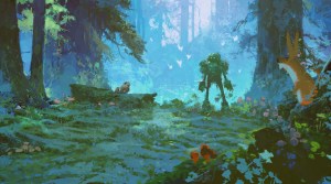
When it came to designing the animation style for The Wild Robot, director Chris Sanders found himself enthralled by the hand-crafted, painterly style of the concept art being developed. Production designer Raymond Zibach remembers within the first month of painting, Sanders started asking, “Why can’t it just look like that?”
“We wanted to make sure that our paintings captured the essence of nature,” says Zibach. “When paintings are done really well, you get that connection through the art and through the artist’s eyes.” Below, Zibach gives insight into how his team developed the look for the film, and gave Roz her wild transformation.
Concept art for ‘The Wild Robot’
DreamWorks
- In the first couple of weeks, Chris Sanders and I were talking a lot about Tyrus Wong’s development art for Bambi. He had done these beautiful watercolors and pastels that were so emotional and really captured nature in a beautiful way.
- We wanted a harsh environment that was always going to be another character that was going to be affecting Roz right from the get-go, and a big part of it was trying to capture the feeling of being in a forest.
- The plants and nature on the island were inspired by what you find in the Sierras, or any of the mountains as you go to the northwest of America, into Canada and maybe even Alaska.

‘The Wild Robot’, from left: Vontra (voice: Stephanie Hsu), Roz (voice: Lupita Nyong’o).
DreamWorks Animation/Universal Pictures/Courtesy Everett Collection

Different stages of “Wild” Roz
DreamWorks
- Roz is the only purely CG element in the opening of the film, before the island has a strong effect on her. Her shift to a hand-painted style becomes more noticeable when another robot, Vontra, arrives.
- We created a painterly effect that the lighters could use to change the look of Roz and loosen her up with the brush strokes, and even make her edges not as clean, which is a big deal in CG.
- There are 34 versions of Roz in the film, just to do the dirt, dents, scratches and moss growing on her and the wooden leg.

Concept art for Fink the Fox.
DreamWorks

Sketches of Fink
DreamWorks
- It took a long time to fine tune the look of the hand-painted fur, but Fink the fox was the first major breakthrough.
- For the animals, we really simplify the painterly technique inside the animals on the shadow side, and then we enhance it on the light side. Much like the way light does work, it picks up more highlights, so we would put more little brush strokes on the lit side and not the shadow side.
- When we’re lighting the scene, the lighter could basically paint in details or lose details. A big part of our style is where we put the detail and where we take out information.

