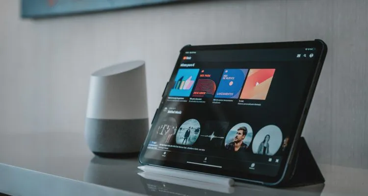
Google wants to improve the music discovery aspects of YouTube. The YouTube Music playlist feature is getting a redesign on Android devices.
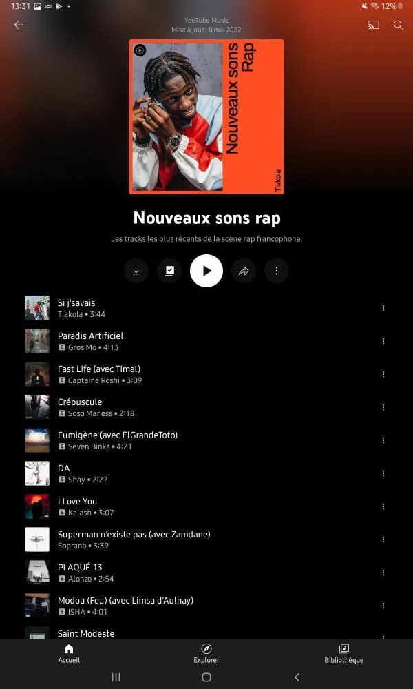
It’s worth noting that the new view puts increased emphasis on who created the playlist and when. The current view only offers the year the playlist was last updated. Cover art appears next with a highlighted artist image and vertical text. The YouTube Music logo now appears in the top-left corner.
One thing of note is there appears to be no button for shuffling. There’s also no way to quickly see how many songs are in the playlist, unlike other music streaming services. Reports of the new interface online seem limited to social media for now – so the beta test may not even be available in the United States.
The images below collected by 9to5Google show the new redesign on a Galaxy Tab A7. A French user downloaded a YouTube Music app update and saw the new interface. It appears to be limited to playlists, since the YouTube Music album view remains the same.
The new YouTube Music playlist redesign also applies to community-generated playlists. Community generated playlists have been one of the biggest reasons that Spotify has dominated the music streaming space. Now the YouTube profile is named at the top of these playlists.
After early feedback was largely negative, Google has been rolling out changes to the YouTube Music experience. The switch from Google Play Music to YouTube Music has been an especially bitter pill for some users to swallow, given that some features available in GPM are no longer available in YouTube Music.
“Just please copy Google Play Music. Don’t try to reinvent the wheel and make this more complicated,” reads one user’s complaint on Google Support forums. “I was completely blown away at how bad YouTube Music is,” another confesses. “The way it’s organized is clunky and not user-friendly. Simply switching from one song to the next takes way too long.”
“If I have to use this crappy app to listen to music, I will be switching to Spotify or something else,” the user concludes. Ouch. No wonder so many changes are coming to the YouTube Music app.


